Designing the packaging for the White Album

About
The recording of “The Beatles” double album, best known as the White Album, ended mid-October 1968, and the album was released on November 22, 1968 in the UK. The packaging of the White Album was conceived in September – October, by pop artist Richard Hamilton, in collaboration with Paul McCartney.
From Wikipedia:
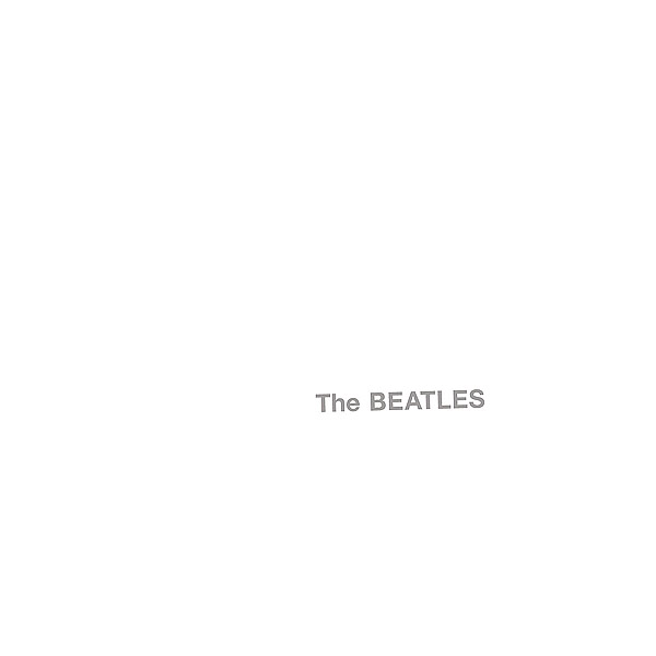
The album’s sleeve was designed by pop artist Richard Hamilton, in collaboration with McCartney. Hamilton’s design was in stark contrast to Peter Blake’s vivid cover art for Sgt. Pepper’s Lonely Hearts Club Band, and consisted of a plain white sleeve. The band’s name was blind embossed slightly below the middle of the album’s right side, and the cover also featured a unique stamped serial number, “to create“, in Hamilton’s words, “the ironic situation of a numbered edition of something like five million copies“. In 2008, an original pressing of the album with serial number 0000005 sold for £19,201 on eBay. In 2015, Ringo Starr’s personal copy number 0000001 sold for world record $790,000 on auction.
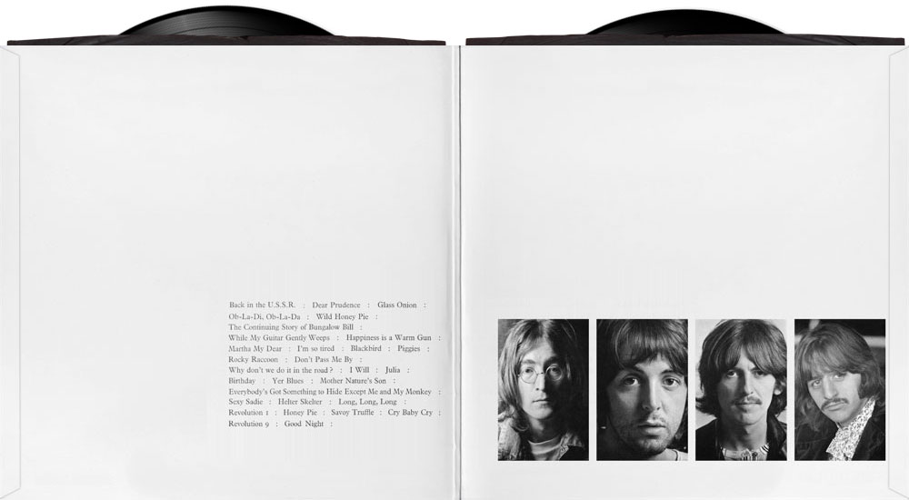
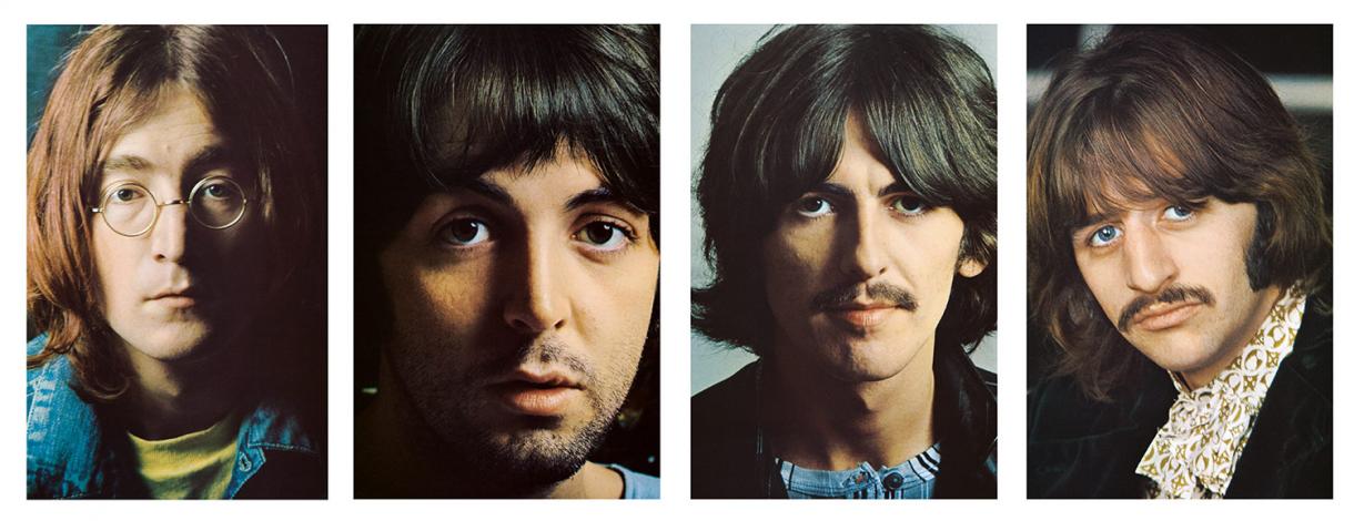
Later vinyl record releases in the US showed the title in grey printed (rather than embossed) letters. The album included a poster comprising a montage of photographs, with the lyrics of the songs on the back, and a set of four photographic portraits taken by John Kelly during the autumn of 1968 that have themselves become iconic. The photographs for the poster were assembled by Hamilton and McCartney, and sorted them in a variety of ways over several days before arriving at the final result.
Tape versions of the album did not feature a white cover. Instead, cassette and 8-track versions (issued on two cassettes/cartridges in early 1969) contained cover artwork that featured high contrast black and white (with no grey) versions of the four Kelly photographs. These two-tape releases were both contained in black outer cardboard slipcase covers that stated “The Beatles” and an Apple logo in gold print. The songs on the cassette version of The Beatles are sequenced differently from the album, in order to equalize the lengths of the tape sides. Two reel-to-reel tape releases of the album were issued, both using the monochrome Kelly artwork. The first, issued by Apple/EMI in early 1969, packaged the entire double-LP on a single tape, with the songs in the same running order as on the LPs. The second release, licensed by Ampex from EMI in early 1970 after the latter ceased manufacture of commercial reel-to-reel tapes, was issued as two separate volumes, and sequenced the songs in the same manner as on the cassette version. The Ampex reel tape version of The Beatles has become desirable to collectors, as it contains edits on eight tracks not available elsewhere, reducing the album’s running time by over seven minutes.
About Richard Hamilton
Art Dealer Robert Fraser brought the idea of asking Richard Hamilton to design the cover and packing of the new album. From Sotheby’s (sothebys.com):
The history behind the cover’s design, like its predecessor, begins with the art dealer Robert Fraser. The Beatles, and their rivals the Rolling Stones, were part of the Swinging London orbit around the dealer, who was known, much to his chagrin, as Groovy Bob. It was Fraser who advised Paul McCartney to bring in a fine artist for Sgt. Pepper, and Blake and Howarth’s peculiarly nostalgic British Pop-art sensibility chimed perfectly with the Beatles’ musical concept for the album. When McCartney approached him again, he suggested Hamilton. Few artists were as influential in British contemporary culture at that time. He had defined Pop art as a leading figure in the Independent Group in the late 1950s – “popular, transient, expendable, low-cost, mass-produced, young, witty, sexy, gimmicky, glamorous, and Big Business”. He was also, by that stage, a founding father of conceptualism in Britain.
Robert had said, ‘What about Richard?’ I knew his work, I knew Just What Is It That Makes Today’s Homes So Different, So Appealing?, so I said, ‘Let’s see how it goes. He might hate the idea.’ And Richard started to get into it so I got encouraged and thought that he would be good to do it. Because, even though I admired Robert, I couldn’t just take his word for it.
Paul McCartney – from “Many Years From Now”, by Barry Miles, 1997
About the white cover
Robert Hamilton first met Paul McCartney at Apple office in Savile Row, to understand what was expected of him.
I tried to get him interested in the whole thing. I laid out what it was we’d got. We’d got an album coming out, we hadn’t really got a title for it. “I’d like you to work on the cover. We’ve done Sgt. Pepper. We’ve worked with a fine artist before and I just had a feeling you might be right.”
Paul McCartney – from “Many Years From Now”, by Barry Miles, 1997
Since Sergeant Pepper was so over the top, I explained, ‘I would be inclined to do a very prissy thing, almost like a limited edition.’ He didn’t discourage me so I went on to propose a plain white album; if that were too clean and empty, then maybe we could print a ring of brown stain to look as if a coffee cup had been left on it – but that was thought a bit too flippant. I also suggested that they might number each copy, to create the ironic situation of a numbered edition of something like five million copies. This was agreed, but then I began to feel a bit guilty at putting their double album under plain wrappers; even the lettering is casual, almost invisible, a blind stamping. I suggested it could be jazzed up with a large edition print, an insert that would be even more glamorous than a normal sleeve.
Robert Hamilton – From “Blinds & Shutters – The Story of the Sixties” by Michael Cooper
Richard asked, “Has there been an album called The Beatles?’ so I referred back to EMI and they said, “No. There’s been Meet the Beatles, introducing the Beatles in America, but there’d never been an album called The Beatles.” So he said, “Let’s call it that”; which is the official title of the White Album.
Paul McCartney – from “Many Years From Now”, by Barry Miles, 1997
So now he was saying, ‘Let’s call it The Beatles and have it white, really white.’ I was saying, ‘Well, I dunno. It’s a great concept, but we are releasing an album here. This is not a piece of art for a rather elite gallery, this is more than that. I see the point. It’s a nice idea, but for what we were to people, and still are, it doesn’t quite fit, we’re not quite a blank space, a white wall, the Beatles. Somebody ought to piss on it or smudge an apple on it for it to become the Beatles, because a white wall’s just too German and marvellous for us.’ So the idea then emerged to do the embossing. ‘Maybe if we emboss the word “Beatles” out of the white, that’ll be good. We’ll get a shadow from the embossing but it’s white on white. It’s still white. That’ll be nice.’ But I still wanted something on the white, an idea, like the apple smudging.
Then Richard had the idea for the numbers. He said, ‘Can we do it?’ So I had to go and try and sell this to EMI. They said, ‘Can’t do it.’ I said, ‘Look, records must go through something to put the shrink wrap on or to staple them. Couldn’t you just have a little thing at the end of that process that hits the paper and prints a number on it? Then everyone would have a numbered copy.’
I think EMI only did this on a few thousand, then just immediately gave up. They have very very strict instructions that every single album that came out, even to this day, should still be numbered. That’s the whole idea: ‘I’ve got number 1,000,000!’ What a great number to have! We got the first four. I don’t know where mine is, of course. Everything got lost. It’s all coming up in Sotheby’s I imagine. John got 00001 because he shouted loudest. He said, ‘Baggsy number one!’ He knew the game, you’ve gotta baggsy it.
Paul McCartney – from “Many Years From Now”, by Barry Miles, 1997
It was Paul who had decided that each album should be individually stamped with a separate number. He confided in me that this was to be part of a unique marketing strategy. Paul said, ‘In a few months, we’re going to have an enormous lottery, and the person with the winning number will win some fantastic prize. It’ll be a real selling point. Everybody will want to buy the album to get that number.’ I said, ‘Actually Paul, I really don’t think that’s such a terrific idea. It sounds a bit cheap to me. The Beatles don’t need those kinds of gimmicks to sell records.’ He replied, ‘Yeah, Pete. I suppose you’re right.’ But, that’s why each White Album sported its own number. I, incidentally, ended up with album number 8.
Pete Shotton – From “The Beatles: Off the Record” by Keith Badman
About the inner sleeve
The inner-sleeve has song titles listed on the inner-left gatefold, on the lower right, and black and white portraits of each Beatles on the lower portion of the inner-gatefolds right side.
The set of the four photographs of the individual band members were taken during the autumn of 1968 by photographer John Kelly.

About the poster insert
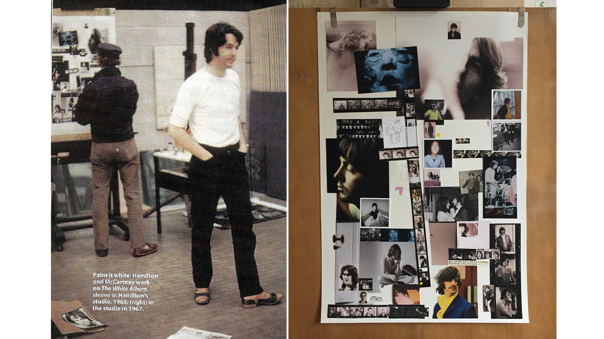
A poster composed of a collage on one side, and song lyrics on the other side, was added as part of the packaging.
Then I began to feel a bit guilty at putting their double album under plain wrappers; I suggested it could be jazzed up with a large edition print, an insert that would be even more glamorous than a normal sleeve.
That’s why the album ended up the way it did. Most people, among them Yoko, think it was Yoko’s idea. I’ve no doubt that she would have been very supportive – from what I knew of her work and Fluxus background, the approach would have been right up her street. It was at the time when Yoko was really moving into the Beatle business and putting her oar in strongly. But my contact with the project was only through Paul – even EMI was held off.
Richard Hamilton – From “The Beatles Diary Volume 1: The Beatles Years” by Barry Miles
[Richard Hamilton] said ‘Have you got any old photos of the Beatles? They must all have family photos from when they were young, or any nice photos. Get me a lot of source material.’ So I acted as the middleman. I went to the guys and said, ‘Childhood photos, what have you got? Look in your cupboards. New photos if you want. Whatever you like,’ and they brought in stuff from the bottom drawer that their mums had kept, along with their old rent books, all the old baby pictures. I told him, ‘My wife’s a photographer. She’s got some pretty cool stuff. Would you like to look at that?’ He said, ‘Yes,’ so I took that out to him as well.
Paul McCartney – from “Many Years From Now”, by Barry Miles, 1997
Richard and I worked together on the collage for The Beatles’ White Album. Richard and I sat down all week while he did the collage from childhood photos of us all. The thing that impressed me at the end of the week was that after he’d filled the whole board with pictures and got his composition right, his final move was to take pieces of white paper and place them strategically to give space through the whole thing so that it wasn’t just crammed with pictures. It was beautiful and I remember being very impressed with the way he put this negative space on – it was the first time that I’d ever seen that idea.
Paul McCartney – From “The Beatles Diary Volume 1: The Beatles Years” by Barry Miles
In 2018, to promote the 50th anniversary of the White Album, a new promotional film for “Glass Onion” brought the creative process behind the poster to life.

Last updated on January 31, 2024