
Early 1971 ?
Designing the packaging for “Ram”
Last updated on July 19, 2025
Early 1971 ?
Last updated on July 19, 2025
Article Dec 26, 1970 • Melody Maker reports The Beatles are looking for a new bassist
Article Dec 31, 1970 • Paul McCartney files a lawsuit against the other three Beatles
Article Early 1971 ? • Designing the packaging for "Ram"
Session Jan 03, 1971 • Overdubs for "Uncle Albert/Admiral Halsey"
Article Jan 09, 1971 • Paul McCartney purchases more land in Scotland

Photo shoot for the “Beatles For Sale” cover
Oct 04, 1964
The Beatles’ “butcher” photo session
Mar 25, 1966
Designing the “Revolver” cover
June - July 1966 ?

Designing the packaging for “Sgt. Pepper’s Lonely Hearts Club Band”
March - April 1967

Designing the packaging for the White Album
September - October 1968
Designing the packaging for “Let It Be”
July 1969 - March 1970 ?

Designing the packaging for “Abbey Road”
August 1969
Test shot for the “Abbey Road” album
August 3 or 7, 1969
The “Abbey Road” photo session
Aug 08, 1969

The Beatles’ last photo session
Aug 22, 1969

Designing the packaging for “McCartney”
Circa March 1970

Shooting of “Wild Life” cover photograph
Oct 01, 1971

Photo shoot of the “Band On The Run” cover
Oct 23, 1973
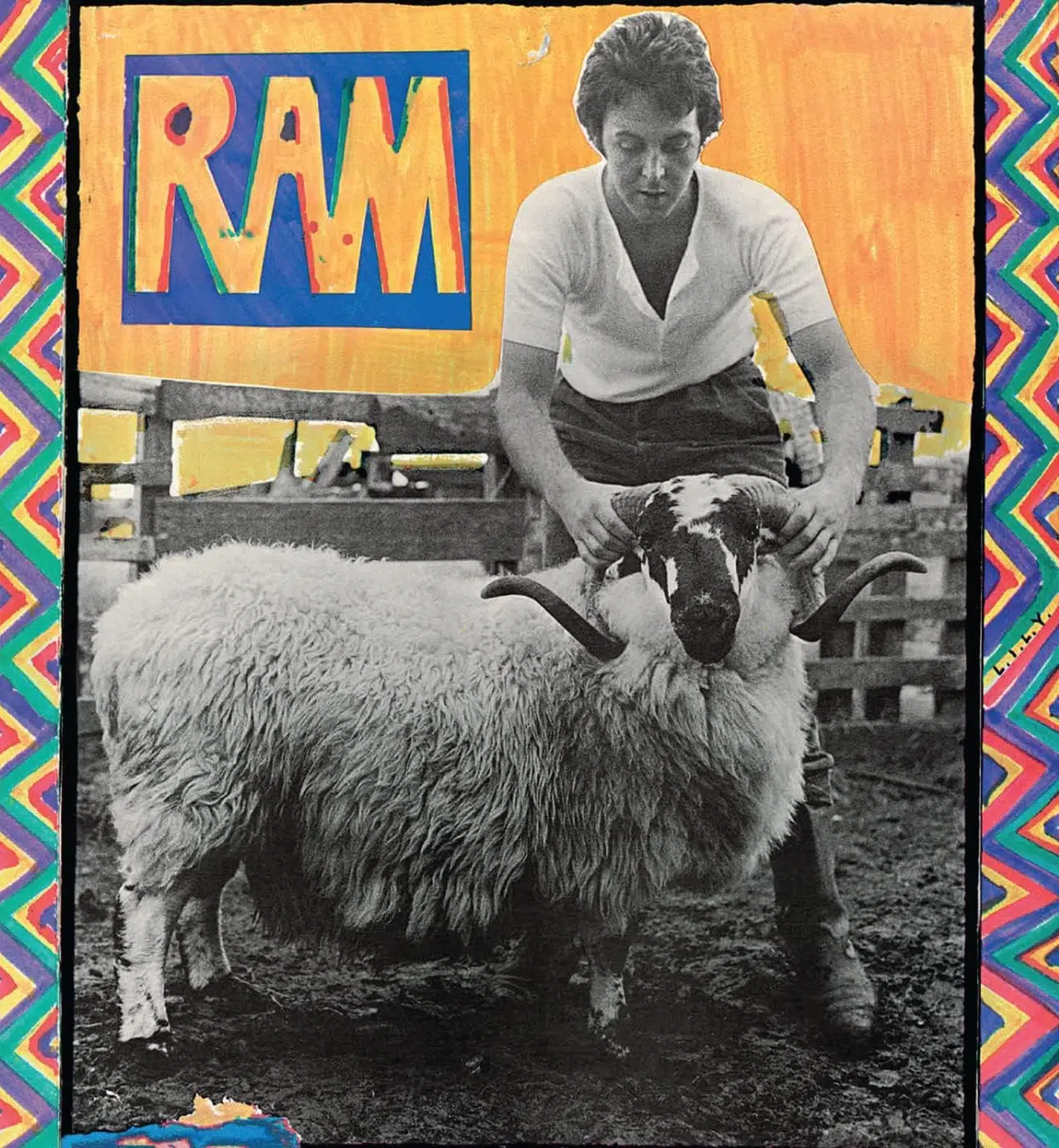
The artwork of “Ram” reflected Paul McCartney’s back-to-basics rural life in Scotland and his desire for a quirky, homemade aesthetic. The cover and packaging were largely conceived and executed by the McCartneys themselves, resulting in a package that was deeply personal in imagery, vibrant in color, and rich with symbolic details.
The front cover of RAM is immediately recognizable for its whimsical farmyard imagery and bold colors. It features a photograph of Paul McCartney on his Scottish farm, holding a ram by its horns. The photo (shot in black-and-white) is set against a brightly colored background – notably a vivid yellow field behind McCartney and the ram – and is surrounded by a hand-drawn border. McCartney himself doodled a multi-colored, childlike frame around the photo using felt-tipped pens. This border consists of rainbow-hued zig-zag patterns that give the cover a naively artistic, almost childlike feel. Within the border, the album’s title “RAM” appears in a stylized, hand-drawn block typography as part of the artwork (rather than a standard typeset font), consistent with the DIY look. The letters are bold and roughly rendered, complementing the playful tone of the design.
Notably, McCartney hid a secret message in the cover art’s border: in amongst the colorful doodles are the tiny letters “L.I.L.Y.”, which stand for “Linda I Love You,” a personal nod to his wife Linda McCartney. This romantic Easter egg went unnoticed by many at first but has since been recognized as a heartfelt detail from Paul to Linda. The overall layout – a central photo framed by Paul’s hand-drawn artwork – gives the cover a “homemade” appearance, which Paul later acknowledged was intentional and “added to the charm” of the album.
The back cover continues the rustic, whimsical theme. It includes the track listing along with more of McCartney’s playful visual touches. Most famously, the back cover features a small photograph of two beetles (insects) apparently copulating. This image, taken by Linda, sits as a subtle visual joke or reference. Some observers at the time interpreted this as a sly piece of symbolism – “two beetles screwing,” seen as an allusion to McCartney’s fraught relationship with his former band, the Beatles. (The album was released amid Paul’s public fallout with John, George, and Ringo.) However, McCartney himself has downplayed this interpretation. He explained years later that Linda included the beetles photo simply because they found it to be “an amazing wildlife picture” from their farm, and any hidden meaning was coincidental: “People said ‘Oh, the Beatles are screwing each other – what’s this mean?’… All sorts of hidden meanings got attached to things,” Paul noted, but he maintains it was not a deliberate message. This mix of found imagery (wildlife photos) and doodled art on RAM’s covers exemplifies the album’s visual ethos – down-to-earth, quirky, and open to interpretation.
The original RAM LP was issued in a gatefold sleeve, adding a spacious canvas for more artwork and photos. The exterior jacket (both front and back) was fully laminated on early pressings – glossy on both the outside and the inside of the gatefold – giving the bright colors extra pop and durability. Upon opening the gatefold, listeners were greeted with additional imagery that extended the album’s homespun, farm-life theme.
According to Paul, the McCartneys took a very craft-oriented approach to the interior design. “When we were doing the layout for the gatefold, we put a little piece of grass from the garden and stuck it on,” McCartney revealed. In other words, the couple literally incorporated natural elements from their Scottish farm into the artwork’s composition. The inside spread of the gatefold featured a collage of snapshots and objects that reflected Paul and Linda’s rural life at the time. This likely included family photos and farm images taken by Linda, small drawings or doodles by Paul, and even that actual blade of grass – all arranged in a scrapbook-like fashion. One of Linda’s photographs inside the gatefold showed Paul’s face framed by a red star shape (a striking image that would later be repurposed for the cover of his Choba B CCCP album). The overall feel of the inner sleeve design was informal and intimate, as if inviting fans into the McCartneys’ rustic lifestyle.
The album’s inner record sleeve for UK/US releases was a standard sleeve (often Apple-branded or plain white) without printed lyrics, as lyrics were not included in the original package. However, international editions provided some extras. Notably, the 1971 Japanese first pressing of RAM included a four-page insert with printed lyrics (in both English and Japanese), tucked inside the gatefold sleeve.
That edition also came with the customary Japanese “obi” strip on the cover, and the gatefold lyrics insert made RAM accessible to Japanese listeners by providing song texts and translations. Most Western releases did not have a dedicated lyric sheet or poster. RAM’s packaging, while creative, was not as grandiose as some late-Beatles releases (there was no large poster or set of bonus photos included for the standard editions). Instead, its special touches were in the details of the printed artwork itself – the gatefold spread, the textured lamination, and the visual Easter eggs planted by Paul and Linda.
One remarkable aspect of RAM’s visual design is that it was largely a do-it-yourself family project. Linda McCartney was the principal photographer for the album art, and Paul McCartney served as the de facto illustrator/art director for the cover. The front cover photograph of Paul with the ram was shot by Linda McCartney in Scotland – in fact, RAM marked the first time Linda shared a full artist credit on one of Paul’s albums, and her photography is central to the album’s imagery. Linda, already an accomplished rock photographer, also supplied the other photos in the package (such as candid shots from their farm and the close-up of the two beetles). The RAM cover photo has become one of Linda’s most iconic portraits of Paul, capturing a lighthearted, pastoral scene that belied the turmoil of the era.
Paul McCartney is officially credited with the album’s artwork/illustrations. He drew the multicolor frame and lettered the title on the cover himself, using simple art materials (felt-tip markers) to create a deliberately naïve, folk-art style design. In essence, Paul was the graphic designer for RAM, assembling the layout and adding his personal artistic flourishes. There was no outside design firm or famous art director behind this cover – unlike some other McCartney albums that used professional designers (e.g. Hipgnosis for Band on the Run), RAM’s visuals were conceived “in-house” by the McCartneys. Paul has recalled sitting “in the sunshine” in Los Angeles, “just doing little drawings and things” for the cover while the album was being finished. This hands-on approach by the artist himself is reflected in the end result: the cover feels intimate and idiosyncratic, as if pulled from Paul and Linda’s personal scrapbook.
Aside from Paul and Linda, no additional illustrators or art directors are prominently credited for the original 1971 release. The couple likely worked with Apple Records’ art department for technical tasks (typesetting the back cover text, preparing print proofs, etc.), but those individuals were not specifically credited in the liner notes. In the credits listings, one simply finds “Cover photography: Linda McCartney; Artwork: Paul McCartney.” This minimalist credit line underscores that RAM’s look was a product of Paul and Linda’s own vision. Their partnership on the visual front mirrored their musical collaboration on the album, making RAM a true joint project in both sound and image.
The visual choices on RAM were imbued with meaning – some intentional, some read into after the fact. Starting with the album’s very title and cover concept: Paul has explained that he chose the word “Ram” as the title because “I just hit upon the word ‘ram’. I thought, well that’s pretty cool, because it’s strong, it’s a male animal, and then there’s the idea of ramming – pushing forwards strongly.”theguardian.com The ram represented resilience and forward momentum, which likely reflected McCartney’s mindset in 1971 – forging ahead with his solo career despite the adversities of the Beatles’ breakup. This thinking is directly mirrored in the cover imagery: Paul literally posing with a ram projects a sense of rural strength and stubbornness. It’s almost a tongue-in-cheek self-portrait of Paul as a rustic ram-handler, suggesting he was embracing a rugged, independent life apart from his former band. (It’s worth noting that Ram is the only album credited to Paul and Linda McCartney, emphasizing their unity as a team during this period.)
In contrast to that symbolism of strength, the playful, hand-drawn style of the cover art conveys a not-so-serious, whimsical intent. The bright colors and naïve drawings were perhaps an effort to visually communicate the album’s eclectic, often light-hearted music. McCartney was consciously moving away from the slick image of the Beatles; the RAM artwork’s almost childlike quality was an expression of creative freedom and domestic bliss. As Paul later said, “It was all very homemade and quirky, but I think that added to the charm of it.”paulmccartney.com This whimsical approach was an artistic choice to make the album feel personal and unpretentious.
Some of the imagery incorporated by the McCartneys carried deeper meanings (intended or not). The tiny “L.I.L.Y.” inscription on the front cover’s border is a deliberate romantic gesture – a hidden declaration of love from Paul to Linda on the very artwork they created togetherudiscovermusic.com. It humanizes the album art, showing that behind the big bold title and funny ram photo, the project is at heart a love letter to Linda. Such personal touches were relatively uncommon on major rock album covers, and it turns the cover into a kind of puzzle or treasure hunt for fans (many didn’t decipher “LILY” for years until it became public what the letters stood forfaroutmagazine.co.uk).
Another debated symbol is the mating beetles photograph on the back cover. Given the toxic breakdown in Paul’s relationship with the other Beatles, it’s easy to imagine this as a visual pun – the Beatles “buggering” each other, as some critics quipped. Indeed, author Peter Brown (a former Beatles associate) even described that picture as symbolic of how Paul felt the other Beatles were treating him at the timeen.wikipedia.org. It was interpreted as Paul’s cheeky commentary on the animosity among the ex-bandmates. However, McCartney has consistently denied that he included the insect photo as a veiled message. He and Linda simply found the image interesting (the insects were a colorful species of beetle on their farm) and added it for fun, not realizing others would read allegories into itpaulmccartney.com. This incident is a prime example of the RAM cover’s open-to-interpretation nature. Fans and observers have projected meanings onto its images – some of which Paul later shrugged off as coincidental. Nonetheless, intentional or not, the beetles on RAM have entered rock lore as a possible satire of “The Beatles.” It shows how even the visual elements of the album became part of the Paul vs. Beatles narrative in the early ’70s.
Finally, the very setting and mood of the cover – Paul in rough farm clothes, holding an animal – was symbolic in that it reintroduced McCartney to the public as a simple family man in the countryside. This was a stark contrast to the Beatles’ last lavish projects (Let It Be’s rooftop concert, Abbey Road’s iconic city crosswalk). With RAM, the imagery said “Paul has left the rock star life in London for a down-home existence.” This back-to-the-land ethos was genuine (the McCartneys were living on their Scotland farm and making music there), but it also served to underscore the album’s themes of domestic contentment (“Heart of the Country” being a prime example on the record). In sum, the visual design of RAM was meant to evoke simplicity, whimsy, and Paul’s personal world – a deliberate break from Beatles pomp, doubling as a subtle assertion of independence and love for Linda.
Though RAM maintained the same core artwork worldwide (Paul with the ram on the front, etc.), there were some notable variations in packaging across different releases and reissues:
In summary, RAM’s international and reissue variations mostly preserved its beloved artwork, while enhancing or recontextualizing it in new formats. The Japanese got lyric inserts; later audiophiles got heavyweight gatefold vinyl; and the Archive box set turned RAM into a multi-media art object. Crucially, Paul and Linda McCartney’s original vision – that quirky photo and neon-colored doodle frame – has remained the defining visual of RAM across all editions. Whether in a thrift shop vinyl bin or a deluxe box on a collector’s shelf, the album is instantly identifiable by its cover, a testament to the enduring impact of the design.
We actually did the cover in LA, me just sitting around in the sunshine doing little drawings and things.
The cover photo was Linda’s and the surrounding border was something I did. It was all very homemade and quirky, but I think that added to the charm of it. I remember when we were doing the layout for the gatefold, we put a little piece of grass from the garden and stuck it on. There were all sorts of little things that just came from our lifestyle at that moment. Linda took a photograph of two beetles copulating, or ‘havin’ it off!’ Of course, this got totally misconstrued, because for us it was just an amazing wildlife picture. How often do you see beetles, and very colourful little iridescent beetles too? Linda just took it as a photo and we liked it, so we put it in. Of course, then people said ‘oh, The Beatles are screwing each other – what’s this mean?’, and all sorts of hidden meanings got attached to things.
Paul McCartney – From Paul McCartney | News | You Gave Me The Answer – RAM Special!
Do the copulating beetles on the sleeve of Ram (1970) stand for F**k The Beatles?
It happened to be a picture Linda had taken. We couldn’t resist it just because of the way it looked. She’d caught these two beetles f**king, and then the significance hit us. We saw that pun, yeah, thought why not?
Paul McCartney – Interview with Q Magazine, January 1998
The McCartney Legacy: Volume 1: 1969 – 73

In this first of a groundbreaking multivolume set, THE MCCARTNEY LEGACY, VOL 1: 1969-73 captures the life of Paul McCartney in the years immediately following the dissolution of the Beatles, a period in which McCartney recreated himself as both a man and a musician. Informed by hundreds of interviews, extensive ground up research, and thousands of never-before-seen documents THE MCCARTNEY LEGACY, VOL 1 is an in depth, revealing exploration of McCartney’s creative and personal lives beyond the Beatles.
The Beatles Diary Volume 2: After The Break-Up 1970-2001
An updated edition of the best-seller. The story of what happened to the band members, their families and friends after the 1970 break-up is brought right up to date. A fascinating and meticulous piece of Beatles scholarship.
Maccazine - Volume 40, Issue 3 - RAM Part 1 - Timeline

This very special RAM special is the first in a series. This is a Timeline for 1970 – 1971 when McCartney started writing and planning RAM in the summer of 1970 and ending with the release of the first Wings album WILD LIFE in December 1971. [...] One thing I noted when exploring the material inside the deluxe RAM remaster is that the book contains many mistakes. A couple of dates are completely inaccurate and the story is far from complete. For this reason, I started to compile a Timeline for the 1970/1971 period filling the gaps and correcting the mistakes. The result is this Maccazine special. As the Timeline was way too long for one special, we decided to do a double issue (issue 3, 2012 and issue 1, 2013).

Notice any inaccuracies on this page? Have additional insights or ideas for new content? Or just want to share your thoughts? We value your feedback! Please use the form below to get in touch with us.


