
August 1969
Designing the packaging for “Abbey Road”
Last updated on July 30, 2025
August 1969
Last updated on July 30, 2025
Article August 1969 • The “Get Back” LP rumours • August 1969
Article August 1969 ? • Paul McCartney gives name to band Sounds Nice
Article August 1969 • Designing the packaging for "Abbey Road"
Session Aug 01, 1969 • Recording "Because"
Session Aug 02, 1969 • Recording "Come And Get It"
Next article August 3 or 7, 1969 • Test shot for the "Abbey Road" album
By The Beatles • LP

Photo shoot for the “Beatles For Sale” cover
Oct 04, 1964
Designing the “Rubber Soul” cover
October 23 - Mid November 1965
The Beatles’ “butcher” photo session
Mar 25, 1966
Designing the “Revolver” cover
June - July 1966 ?

Designing the packaging for “Sgt. Pepper’s Lonely Hearts Club Band”
March - April 1967

Designing the packaging for the White Album
September - October 1968
Designing the packaging for “Let It Be”
July 1969 - March 1970 ?

Test shot for the “Abbey Road” album
August 3 or 7, 1969
The “Abbey Road” photo session
Aug 08, 1969

The Beatles’ last photo session
Aug 22, 1969

Designing the packaging for “McCartney”
Circa March 1970
Designing the packaging for “Ram”
Early 1971 ?

Shooting of “Wild Life” cover photograph
Oct 01, 1971

Photo shoot of the “Band On The Run” cover
Oct 23, 1973
For a more in-depth look at this photo session, please refer to Roger Stormo’s The Daily Beatle and its article titled “Abbey Road – The Road That Goes On Forever.“
During the recording of “Abbey Road,” engineer Geoff Emerick was smoking Everest cigarettes in the studio. The Beatles took a liking to the simple, striking image of their silhouette against a white mountain — and adopted “Everest” as the working title for their then-untitled upcoming album.
However, the idea of flying to the Himalayas for a photo shoot was quickly dismissed as impractical. According to Mal Evans’ diary, the band considered other titles (“Billy’s Left Foot,” “All Good Children Go To Heaven,” “Four In The Bar,” “Turn Ups,” “Inclinations“…), but none felt right. Eventually, Paul McCartney suggested they simply name the album after the street outside EMI Studios and take the cover photo there. (Geoff Emerick later claimed it was Ringo Starr who first proposed this idea, but even Ringo said it was Paul’s idea.)
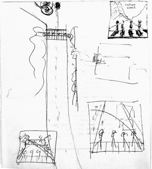
Paul sketched out a rough concept for the cover: the four of them walking across the zebra crossing. Photographer Iain Macmillan was brought in to execute the idea and added a more detailed drawing in the top right corner of Paul’s sketch.
While we were in the studio, our engineer Geoff Emerick always used to smoke cigarettes called Everest, so the album was going to be called Everest. We never really liked that, but we couldn’t think of anything else to call it. Then one day I said, ‘I’ve got it!’ – I don’t know how I thought of it – ‘Abbey Road’! It’s the studio we’re in, which is fabulous, and it sounds a bit like a monastery.
Paul McCartney – From “The Beatles Anthology” book, 2000
We were stuck for an album title, and the album didn’t appear to have any obvious concept, except that it had all been done in the studio and it had been done by us. And Geoff Emerick used to have these packets of Everest cigarettes always sitting by him, and we thought, ‘That’s good. It’s big and it’s expansive.’
Paul McCartney – From “Solid State: The Story of “Abbey Road” and the End of the Beatles” by Kenneth Womack
Abbey Road was going to be called Mount Everest, till almost the second we walked out on the crossing, because of [Beatle engineer] Geoff Emerick’s cigarettes. Everything was always in a great state of flux, as it is when you’re making an album.
Paul McCartney – From “Conversations with McCartney” by Paul du Noyer, 2016
We went through weeks of all saying, ‘Why don’t we call it Billy’s Left Boot?’ and things like that. And then Paul just said, ‘Why don’t we call it Abbey Road?’
Ringo Starr – From “The Beatles Anthology” book, 2000
“Well, if we’re not going to name it Everest and pose for the cover in Tibet, where are we going to go?” a frustrated Paul asked one afternoon. John and George Harrison looked flummoxed. Finally, Ringo chirped in. “Fuck it; let’s just step outside and name it Abbey Road,” he joked.
Geoff Emerick – From “Here, There and Everywhere: My Life Recording the Music of The Beatles“, 2006
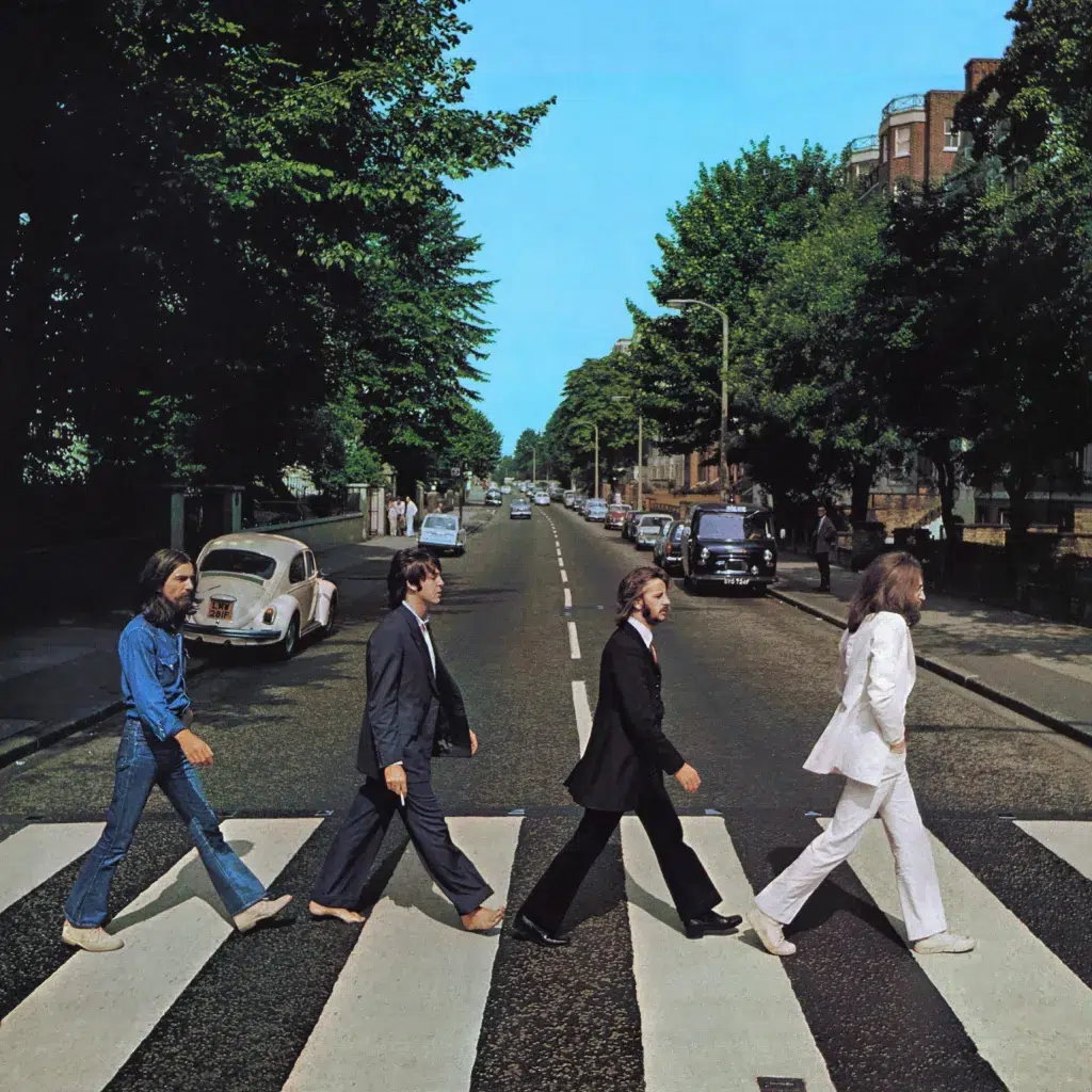
In the days leading up to the shoot, Iain Macmillan took a test photo with four stand-ins to give The Beatles a preview of the intended composition. Then, on August 8, 1969, at around 10 a.m., Paul, John, George and Ringo gathered outside EMI Studios for the photo session.
Macmillan, standing on a stepladder in the middle of the street and armed with a Hasselblad camera, took just six shots of the band crossing Abbey Road.
On the same day, presumably, Macmillan also photographed a street sign to be used on the album’s back cover. He chose the junction of Abbey Road and Alexandra Road. During the shoot, a young woman in a blue dress walked through the frame — initially frustrating Macmillan, though the candid moment was ultimately kept and featured on the reverse sleeve.
Apple’s newly appointed creative director, 23-year-old John Kosh, was tasked with designing the packaging for the upcoming album using Iain Macmillan’s photographs — and he had to do so on a tight deadline.
Out of the six photos taken by Macmillan, frame #5 was quickly selected. It was the only image in which Paul, John, George and Ringo were all walking in perfect step. Symbolically, it shows the band walking away from EMI Studios — the place where they had crafted the majority of their work over the previous seven years.
The chosen photo underwent some light editing. It was slightly cropped to center the group, and colour corrections were made — particularly to enhance the blue of the sky and increase overall contrast.
John Kosh made a bold creative decision: he chose not to include the band’s name or the album title on the front cover. EMI chairman Sir Joseph Lockwood reportedly objected, fearing it would hurt sales. But the Beatles supported Kosh’s vision, and with the release deadline fast approaching, the cover went to press as originally designed.
This was my first album cover, not really knowing what I was doing. The fact that it’s turned into an icon, and possibly the most parodied album cover of all time, is really thrilling to me.
John Kosh – From Forbes, September 24, 2019
I was under the impression it was for publicity — ‘we needed pictures.’ Iain, however, would probably tell you a different story—it was going to be an album cover. The whole thing was such a rush because I was working on other projects. And all of a sudden, it was like, ‘Okay, these are the photographs, we need an album cover, bang!’ And that’s it.
John Kosh – Apple’s Creative Director – Talking about Iain Macmillan’s photos – From Forbes, September 24, 2019
The thing was, as far as I can recall, the pictures were only supposed to be publicity shots. They were never intended for an album cover, no matter what Paul McCartney says. It changed into an album cover when EMI saw the shots and decided they wanted an album cover by, say, Wednesday and this was Monday, something like that.
That same evening we had the pictures rush-processed. We put them on the lightbox and went through them one by one. And it seemed to me that the one we chose was the most obvious one. They were all supposed to be in step but of course they’re not. It took about twenty minutes for people to decide that it went from publicity shots to an album cover. We were poring over the pictures when we got a note from EMI saying they needed an album cover fast.
I had been working on Let It Be, which of course was supposed to come out first. Then the lads had got together again and did such a fantastic job that everyone knew this record would have to come out before Let It Be. So that then was the trigger for everyone running about like blue-arsed flies.
It was my decision not to have the word “Beatles” on the cover, which caused me all kinds of trouble. It occurred to me that anyone who didn’t know who these four guys are must have been living in a cave or something. They were the four most famous musicians on the planet. They didn’t need the name of the band on the album. So we did not put the name “Beatles” on the cover which, looking back, was pretty radical for a twenty-three-year-old.
But in all honesty I was scared stiff. And then Sir Joseph Lockwood, who was the chairman of EMI, phoned me at 3 a.m. He said I would cost them thousands of sales by not having the name of the band on the cover.
He was absolutely livid, furious. I was still half-asleep but when someone like that is raging down the phone at you, you wake up pretty quick. To be honest, I was shocked, not so much by the phone call as the language. He had this upper-class English accent and he was calling me a fucking prick. The reason he phoned me at three in the morning was he had just found out the cover had gone to press.
So I went into Apple the next day scared stiff and the first person I saw was George Harrison and I told him about the phone call and that Sir Joseph Lockwood was after my blood. He just said, “Fuck it, man, we’re The Beatles.”
In the end, the album has sold something like twenty-six million copies or something ridiculous like that, so I feel fairly vindicated. But at the time I was very nervous and very worried. You really did have to hold on to your sphincter. Sir Joseph Lockwood was a very powerful force in the music industry and had been for a long time. He was a man used to getting his own way.
John Kosh – From “And in the End: The Last Days of the Beatles” by Ken McNab, 2019
I thought, ‘Here are the four Beatles walking across the street. If you do not know who they are, you have definitely been in a cave somewhere.’ It was not necessary—not to mention the fact that there was enough publicity about the Beatles’ new album coming out. They are the Fab Four. I just knew it didn’t need any explanation whatsoever.
John Kosh – Apple’s Creative Director – From Forbes, September 24, 2019
It was projected at me that I was ruining the Beatles’ careers. As a 23-year-old, my knees were trembling (laughs). I didn’t know what to do. So you can imagine I had a very bad night.
I went to Apple Records in the morning, and George Harrison was there, which is also very unusual for a Beatle to show up before 3 in the afternoon. I told him the story. George looked at me and said, ‘Oh [forget] it. We’re the Beatles.’ So that was the end of that. George was such a sweet man. All the Beatles were fun to work with.
John Kosh – Apple’s Creative Director – From Forbes, September 24, 2019
Apple sent me a [£300] check for that cover, and it was signed by ‘John Lennon and Paul McCartney.’ What did I do? I had to pay the rent and I cashed it. Idiot! (laughs). Otherwise I’d be phoning you from Bali right now.
John Kosh – Apple’s Creative Director – From Forbes, September 24, 2019
The back cover was created with the assistance of retoucher John Cockcroft, who worked for the company Colorcell — a firm Iain Macmillan was collaborating with at the time.
Unfortunately, Macmillan’s original photograph of the Abbey Road street sign has not surfaced, making it difficult to determine which elements of the final composition were part of the original image and which were retouched or enhanced by Cockcroft using the Kodak Dye Transfer process.
For instance, a photograph taken by tourists sometime after the album’s release shows the Abbey Road sign with a prominent vertical crack, and the letters “O” and “A” in “ROAD” missing. It’s unclear whether these letters were already damaged when Macmillan took his photo, or if Cockcroft restored or inserted them during the retouching process.
What is certain is that the word “BEATLES” — rendered in the same typeface as the “Abbey Road” text — was added by Cockcroft. Other street signs had reportedly been photographed (possibly by Macmillan, though this remains unconfirmed) to collect all the necessary letters to construct the band’s name.
An early mock-up of the back cover did not feature “BEATLES” at all. This raises the possibility that the original intention may have been to omit the band’s name from both the front and back covers. The addition of “BEATLES” on the back may have been a last-minute compromise to appease EMI chairman Sir Joseph Lockwood.
The girl in the blue dress, who happened to walk through the frame during the shoot and appears on the back cover, has never been identified.
I found out much later in life, when I started working with my Dad [John Cockcroft] in his studio that he had retouched the Beatles Abbey Road album cover, Rolling Stones magazine’s 14th greatest album of all time. Abbey Road was shot by Scottish photographer Iain Macmillan (1938 – 2006), Macmillan was given only ten minutes to take the shot and its ironical that it has become one of the most famous and imitated album covers in recording history.
Iain used Colorcel, a London dye transfer and Print Processing Service with a strong retouching department of which dad was the head. Did they retouch stuff back in 1969, I hear you ask?
Indeed they did, in fact prior to this album coming out a major shake up had occurred for retouchers with the introduction of a new Kodak technique called the Dye Transfer process, a continuous-tone color photographic printing process. The dyes used in the process are very spectrally pure compared to normal coupler-induced photographic dyes,The dye transfer process possesses a larger colour gamut and tonal scale than any other process. Another important characteristic of dye transfer is that it allows the practitioner the highest degree of photographic control compared to any other color print process, and for a retoucher was a development as dramatic as digital.
Previously retouching was predominantly darkroom / montage and airbrush territory but this new process allowed the retoucher to bleach out unwanted areas of the image and draw in with brush using the same set of dyes used in the print, making the work undetectable in the hands of a master.
So what did John do on this cover? On the back cover the lettering “Beatles” did not exist, shots were taken of street lettering in and around London that matched the Abbey Road signage. From these shots a composite was created of the Beatles lettering and then combined and used to mask this area out on the master set of dye matrixes so that when a new dye was made the combined lettering would be part of the image. Whatever imperfections then existed (masking lines etc) where bleached out and the detail tickled back in with a fine brush using dyes mixed and matched by John to recreate the colours needed, the infamous crack in the “s” was bleached back and then drawn in, if this was John’s input or a request from the art director I don’t know, but it helped the lettering look real.
The front cover had no lettering or title just the fab four walking across the road as Apple art director Kosh felt it wasn’t needed. A controversial decision at the time (reportedly the head of EMI was not pleased). Abbey Road was also the start of the “Paul is dead” conspiracy theories, with some saying the crack in the S was there to represent troubles in the band! I think my dad just drew it in to make the letters look like they where real. lol.
The print worked on was a dye transfer produced by the lab from Iain’s transparency film using separation negatives. Dye transfers where the only colour photography prints accepted by museums because they where very archival, with an estimated life of 100 to 400 years, depending on who you talked to. I wonder if the original retouched dye still exists buried somewhere in Apples archives. In 1994 Kodak officially discontinued the dye transfer process.
Mike Cockcroft – Son of John Cockcroft – From Bitdepth: John Cockcroft – Master Retoucher 1934 -2008, 2010
Prior to and during my university years I spent my summers working for the commercial photo processing laboratories Colourcel Ltd in Old Street, near Old Street tube station. In my third summer I went inside and learned how to process prints. When the print was signed off, an extra copy would be kept, in case of problems in the studio during retouching, and the modified dyes would be bottled, and used by the in-house artists to retouch the print using the same dyes as had been used for the print.
The Abbey Road print, as I recall, did not present any color problems, but a registration challenge. It required the main image, which had been altered during generation of the separations to have a blank area where the Beatles name would go. As can be seen from the artwork, letters or pairs of letters each represented a separate image to be printed. These were added as further sets of separations to write the name “Beatles” in the space that had been created. The missing letters were found by Iain Macmillan from other streets.
As can be seen from the artwork, there are gaps around the “Beatles”, and other marks that were later fixed by the in-house artists.
Particular points of note:
- The girl in the picture is not a separate image
- Letters are used from the Abbey Road letters. You can see shaded parts in common.
- Ian [sic] Macmillan found a letter S with a crack. In the retouched artwork doesn’t quite line up.
I kept the artwork for many years in excellent condition, but over the years, the paper hardened. Damage occurred when my then teenage daughter tried to tidy my office at home. She rolled up the artwork, then placed other stuff on top, which cracked the artwork. I avoided further damage for a number of years.
Having seen Ashleigh Brown on a television documentary about paper conservation. I contacted her and commissioned a conservation of the artwork. The object was to stabilize and preserve. As it was my intention to sell the artwork, with none of my family wanting it, I was recommended to do no further work other than conservation
From Lot Detail – The Beatles 1969 Vintage Iain Macmillan Colour Photographic Artwork Print Used In The Production Of The Abbey Road Album Sleeve


The Beatles Diary Volume 1: The Beatles Years
With greatly expanded text, this is the most revealing and frank personal 30-year chronicle of the group ever written. Insider Barry Miles covers the Beatles story from childhood to the break-up of the group.
Solid State: The Story of "Abbey Road" and the End of the Beatles
Acclaimed Beatles historian Kenneth Womack offers the most definitive account yet of the writing, recording, mixing, and reception of Abbey Road. In February 1969, the Beatles began working on what became their final album together. Abbey Road introduced a number of new techniques and technologies to the Beatles' sound, and included "Come Together," "Something," and "Here Comes the Sun," which all emerged as classics.

Notice any inaccuracies on this page? Have additional insights or ideas for new content? Or just want to share your thoughts? We value your feedback! Please use the form below to get in touch with us.

