October 23 - Mid November 1965
Designing the “Rubber Soul” cover
Last updated on December 30, 2025
October 23 - Mid November 1965
Last updated on December 30, 2025
Location: Kenwood house • Weybridge • UK
Previous article Oct 15, 1965 • Paul and Jane attend Ben E. King concert at The Scotch of St James
Session Oct 22, 1965 • Recording "In My Life", "Nowhere Man"
Interview Oct 22, 1965 • Paul McCartney interview for New Musical Express
Article October 23 - Mid November 1965 • Designing the "Rubber Soul" cover
Session Oct 24, 1965 • Recording “I’m Looking Through You”
Next article Oct 26, 1965 • The Beatles receive their MBEs

Photo shoot for the “Beatles For Sale” cover
Oct 04, 1964
The Beatles’ “butcher” photo session
Mar 25, 1966
Designing the “Revolver” cover
June - July 1966 ?

Designing the packaging for “Sgt. Pepper’s Lonely Hearts Club Band”
March - April 1967

Designing the packaging for the White Album
September - October 1968
Designing the packaging for “Let It Be”
July 1969 - March 1970 ?

Designing the packaging for “Abbey Road”
August 1969
Test shot for the “Abbey Road” album
August 3 or 7, 1969
The “Abbey Road” photo session
Aug 08, 1969

The Beatles’ last photo session
Aug 22, 1969

Designing the packaging for “McCartney”
Circa March 1970
Designing the packaging for “Ram”
Early 1971 ?

Shooting of “Wild Life” cover photograph
Oct 01, 1971

Photo shoot of the “Band On The Run” cover
Oct 23, 1973
The decision to title the album “Rubber Soul” predated the cover design and stemmed from the band’s own sense of humour. Paul McCartney coined the phrase as a pun after hearing an American musician describe Mick Jagger’s style as “plastic soul”, implying a form of soul music that was imitative rather than authentic. The Beatles adopted “Rubber Soul” as a tongue-in-cheek acknowledgement that their own take on soul music was, in a sense, elastic and manufactured when compared to the real thing.
So far the new Beatles LP has no title. Paul spent most of the time out of the studio and in the dressing room trying to decide what the LP should be called. Titles which arose during the course of the afternoon were “It’s The Bloody Beatles Again!”, “Eight Feet Away” and phrases he picked out at random from his road manager’s paperback.
From Disc Weekly – November 6, 1965
The title Rubber Soul was kind of, ‘Hey man, it’s got soul – it’s a lot of soul. A lot of soul, that music’. – It was a spoof on that you know. Seemed nice and amusing. Very us – you know, very whacky.
Paul McCartney – From Rubber Soul | The Beatles
I think the title Rubber Soul came from a comment an old blues guy had said of Jagger. I’ve heard some out-takes of us doing “I’m Down” and at the front of it I’m chatting on about Mick. I’m saying how I’d just read about an old bloke in the States who said, ‘Mick Jagger, man. Well you know they’re good – but it’s plastic soul.’ So ‘plastic soul’ was the germ of the Rubber Soul idea.
Paul McCartney – From “The Beatles Anthology” book, 2000
What was “Rubber Soul”? That was just a simple play on…
Oh, that was Paul’s title, it was like “Yer Blues,” I suppose, meaning English soul. “Rubber Soul” is just a pun. There’s no great mysterious meanings behind all of this. It was just four boys working out what to call their new album.
John Lennon – 1970 interview – From “Lennon Remembers” by Jann S. Wenner, 2000
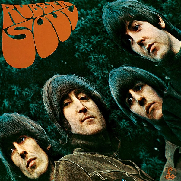
For the cover of the new album, photographer Robert Freeman was once again commissioned. He had previously shot the album covers for “With The Beatles“, “Beatles For Sale“, “A Hard Day’s Night” and “Help!“. “Rubber Soul” would be the last Beatles album to feature a Freeman cover. Although he was asked to submit artwork for the group’s follow-up album “Revolver” in 1966, The Beatles ultimately chose not to use his proposal.
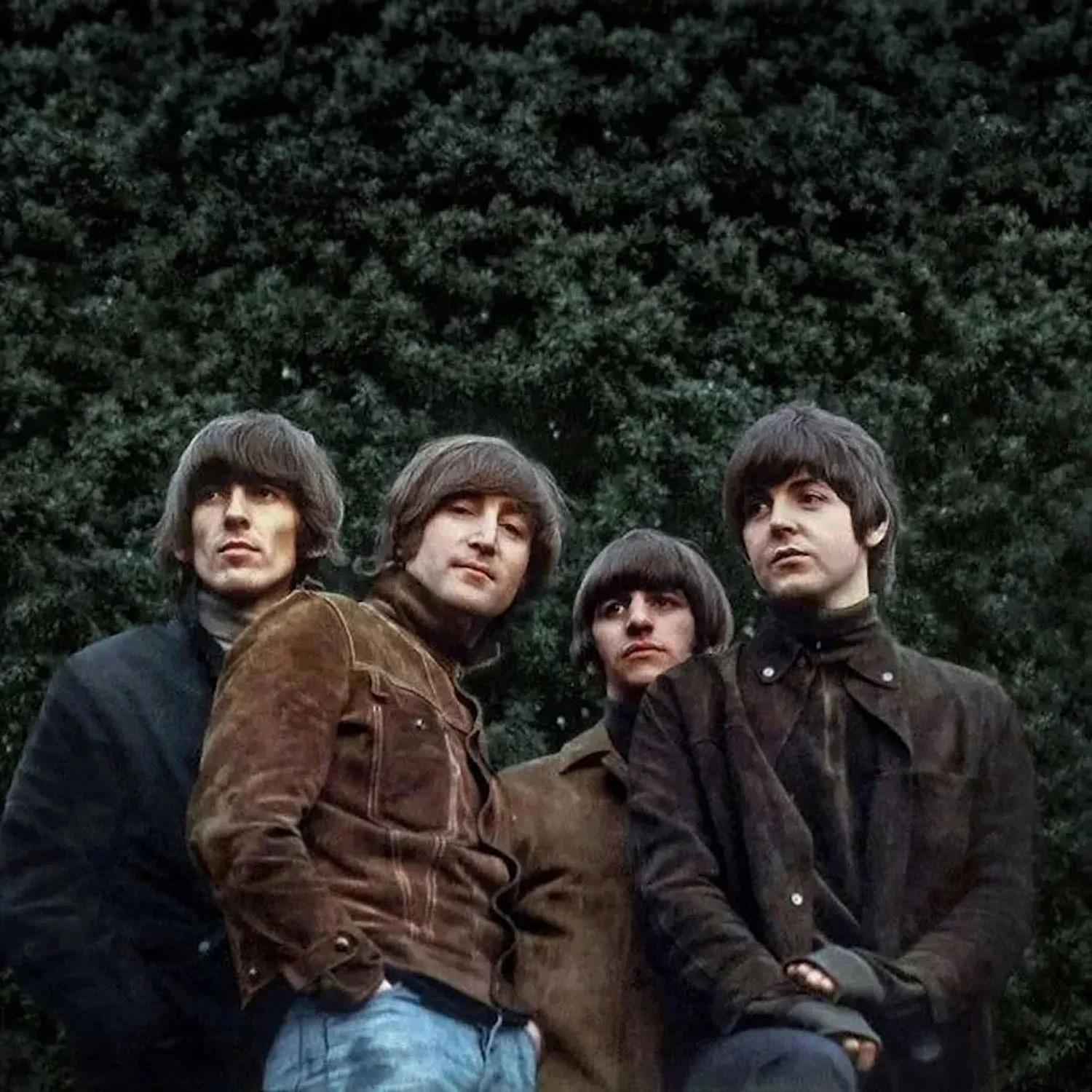
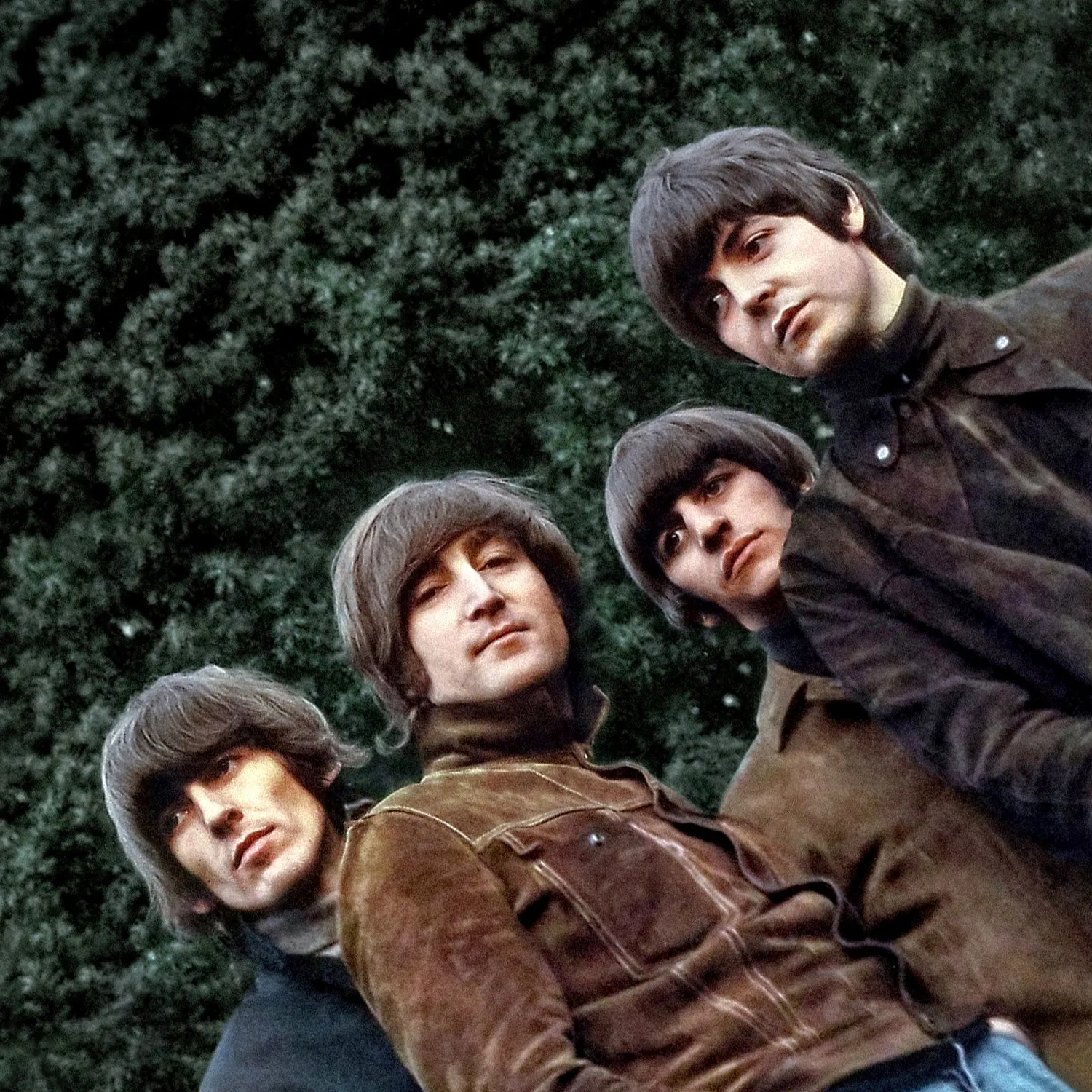
For this assignment, Freeman wanted to move away from the visual approach of the earlier covers. He aimed for a different mood and tonality, favouring an almost monochromatic palette of browns and greens. The photo shoot took place at or around John Lennon’s home, Kenwood, in Weybridge, Surrey. The exact date remains unconfirmed, although October 23, 1965, is often cited. The Beatles arrived wearing suede jackets and turtlenecks that matched the colour palette Freeman had envisaged. Unlike the earlier album covers, however, they were no longer dressed identically, subtly signalling the emergence of individual identities within the group’s visual presentation.
Freeman later recalled that the photographs were taken in the garden of John’s house. However, in the book “The Beatles’ London” by Piet Schreuders and Mark Lewisohn, it is noted that “the Beatles’ then chauffeur Alf Bicknell specifically recalled it being taken a few miles away in the woods at Old Lane, Hatchford End, near the disused Wisley Airfield.“
Only one known raw group photograph from this session has surfaced, and it is the image that was ultimately used for the album cover.
For this cover I wanted another angle of the group and an entirely different tonality – greens, browns and black, but with an almost monochrome look. The garden of John’s house in Weybridge had the right elements – a high, dark green hedge and a grass knoll that sloped away steeply. This provided the background and the angle.
We arranged for the Beatles to wear clothes in appropriate colours, with black polo-neck sweaters or shirts. They were beginning to wear more varied clothes anyway, so uniformity was out. Paul came down from London for the shot; the other three lived in the area. It’s slightly eerie, in view of what happened later, that John is the odd one out looking down at the camera.
Robert Freeman – From “The Beatles – A Private View” by Robert Freeman, 1993
After the photo shoot, Robert Freeman prepared colour slides of his photographs for the Beatles to review. A few days later, the band met to select the album cover. Freeman projected the slides onto a piece of white cardboard cut to the size of an LP sleeve, allowing them to visualise how each image might work as a cover.
As the group examined the various poses, they settled on a preferred shot. Paul McCartney later recalled that, at that moment, “the card that the picture was projected onto fell backwards a little, elongating the photograph. It was stretched and we went, ‘That’s it, Rubber So-o-oul, hey, hey! Can you do it like that?’” The accidental tilt of the projection distorted and elongated their faces — an effect that immediately appealed to everyone present. The Beatles asked Freeman whether reproduce the image with that warped perspective, and he assured them that he could.
I liked the way we got our faces to be longer on the album cover. We lost the ‘little innocents’ tag, the naivety, and Rubber Soul was the first one where we were fully-fledged potheads.
George Harrison – From “The Beatles Anthology” book, 2000
The album cover is another example of our branching out: the stretched photo. That was actually one of those little exciting random things that happen. The photographer Robert Freeman had taken some pictures round at John’s house in Weybridge. We had our new gear on – the polo necks – and we were doing straight mugshots; the four of us all posing.
Back in London, Robert was showing us the slides; he had a piece of [white] cardboard that was the album-cover size and he was projecting the photographs exactly onto it, so we could see how it would look as an album cover. We had just chosen the photograph when the card that the picture was projected onto fell backwards a little, elongating the photograph. It was stretched and we went, “That’s it, Rubber So-o-oul, hey, hey! Can you do it like that?” And he said, “well, yeah. I can print it that way.” And that was it.
Paul McCartney – From “The Beatles Anthology” book, 2000
When we came to look at the selection of slides, the white card they were being projected onto tilted slightly, distorting the image. The Beatles liked this effect and I subsequently found away of matching it by having the image tilted in the enlarger and copied onto a larger transparency.
The only way to have achieved the monochrome look I wanted was by having a special print made. However, I couldn’t get the necessary funds (a few hundred pounds) from EMI or Brian Epstein to do this and, consequently, the image never had the quality I intended. It’s reproduced here in a new
Robert Freeman – From “The Beatles – A Private View” by Robert Freeman, 1993
monochrome version.
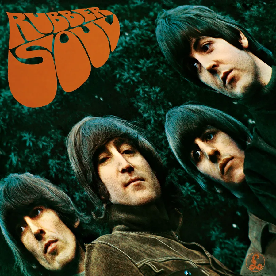
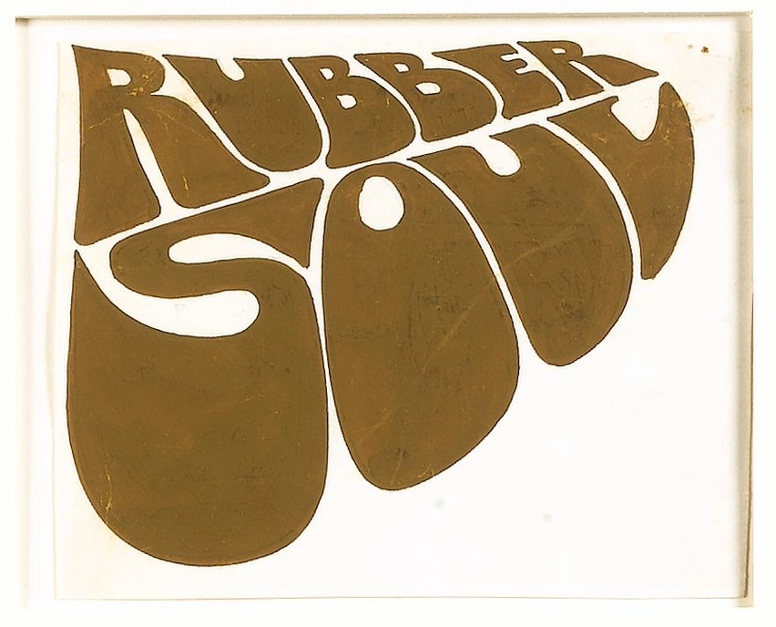
While Robert Freeman’s photograph provided the centerpiece, the album’s graphic design – especially the unique title lettering – added another iconic element. The words “Rubber Soul” appear on the upper left corner of the cover in a groovy, exaggerated hand-drawn font that seems to melt or drip. This distinctive lettering was created by illustrator Charles Front, who was approached by Freeman to design the album’s title logo. Front later explained that his inspiration came directly from the album’s name rather than any psychedelic or drug-related influence: “It was all about the name of the album. If you tap into a rubber tree then you get a sort of globule of sap, so I started thinking of creating a shape that represented that – starting narrow and filling out.” As a result, each letter in “Rubber Soul” begins thin at one end and bulges at the other, mimicking a droplet of liquid rubber. The finished logo has an organic, bubble-like quality that subtly echoes both the album’s title and the distorted faces on the cover.
The design combining Freeman’s photograph and Front’s lettering was shown to Brian Epstein, and arrangements were made to present it to the band as quickly as possible. During a recording break at EMI Studios, Abbey Road, the cover concept was shown to the Beatles and was immediately approved. Front was then asked to produce a second version of the lettering for final production. This version remained essentially the same as the first, but featured very slight and subtle refinements to the letterforms and to the spacing in and around them.
The front cover layout featured only the distorted photograph of the Beatles and the title logo — the band’s name does not appear anywhere on the front sleeve. This was a bold decision at the time, and an idea that would later be reused for “Revolver” in 1966 and “Abbey Road” in 1969, the latter of which also omitted the album title entirely.
To me it was just another piece I’d done and I had put it away and forgotten about it. When I took it down to Bonhams I went on the underground with it in a carrier bag. When I came back after discovering its value I was absolutely clutching it in a case. […] Whether the Beatles were into LSD or not I don’t know but I certainly wasn’t. It was all about the name of the album. If you tap into a rubber tree then you get a sort of globule, so I started thinking of creating a shape that represented that, starting narrow and filling out. I was paid 26 guineas and five shillings.
Charles Front – From The Guardian, June 17, 2007
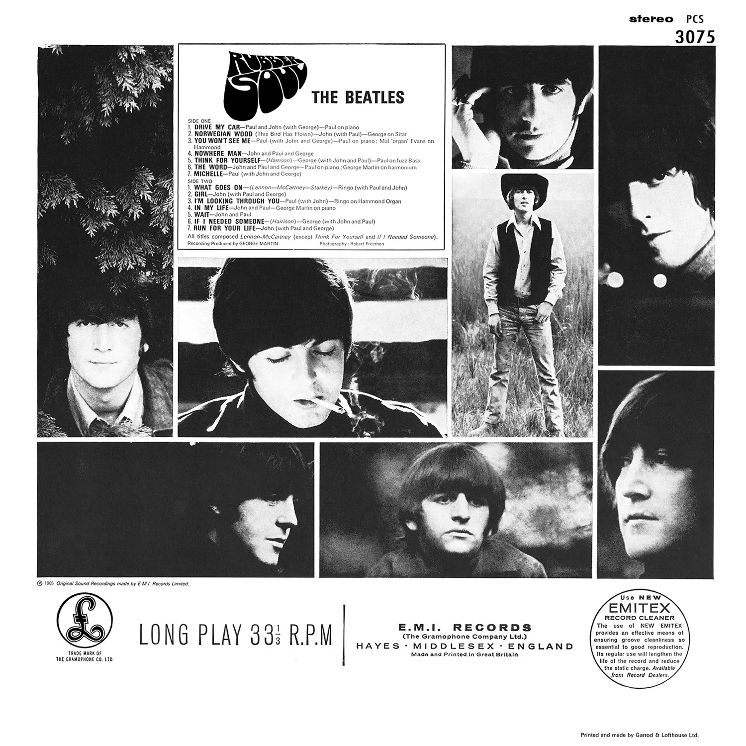
On the UK edition, the back cover featured a montage of black-and-white photographs, also taken by Robert Freeman, arranged in a grid or film-strip style. Eight candid or posed images — two of each Beatle — showed them in various moods and profiles, providing a stark monochrome contrast to the rich colour of the front cover. At the top of the sleeve, the album’s track listing and credits were printed in black text, with the “Rubber Soul” title logo repeated in a reduced size.
Notably, UK pressings also included the “Use EMITEX” blurb on the back cover, encouraging the use of EMI’s record-cleaning cloth, along with the circular “Long Play 33⅓ R.P.M.” emblem. The Parlophone logo and the printer’s credit appeared in the lower corner of the sleeve.
The U.S. edition’s artwork of “Rubber Soul” featured a subtle variation. Capitol Records adjusted the colour of the title lettering on the front cover: the American release used a more muted brown tone, closer to the colour of the suede jackets, whereas the original UK sleeve featured a more vibrant orange-brown hue. When viewed side by side, the U.S. title appears slightly darker.
Aside from this minor adjustment, Capitol retained the same cover photograph and overall design as the UK edition, including the decision to omit the name “The Beatles” from the front cover.
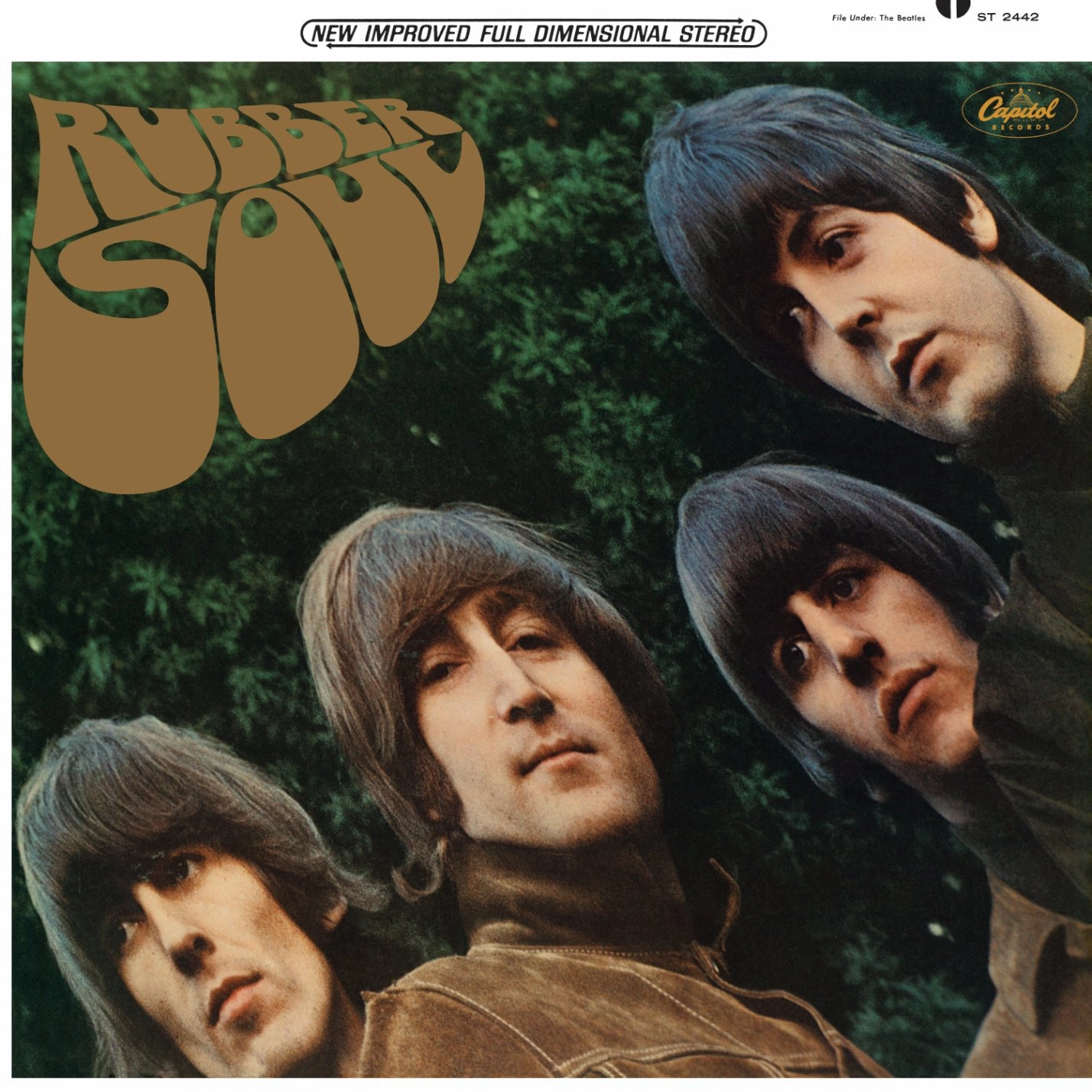
George Harrison later remarked that the cover’s look was “appropriate” for the band at that point in their career, as it allowed them to shed their earlier image: “We got our faces to be longer on the album cover. We lost the ‘little innocents’ tag, the naivety, and ‘Rubber Soul’ was the first one where we were fully-fledged potheads.” In this sense, the subtly distorted, slightly “woozy” appearance — combined with their relaxed, unsmiling expressions — reflected the Beatles’ transition into a more experimental, marijuana-influenced phase of their lives.
Charles Front, however, downplayed the idea that his lettering was designed under the influence of LSD or any other drug. He maintained that he was not using drugs at the time and that his approach was purely literal, rooted in the rubber metaphor suggested by the album’s title. Any psychedelic or “trippy” associations in the lettering were, as he later put it, “sheer coincidence.” Nonetheless, the “Rubber Soul” title font proved hugely influential. Its rounded, hand-drawn style became closely associated with the emerging hippie aesthetic, and many psychedelic concert posters and album covers of the late 1960s would adopt similar flowing letterforms.


The Beatles Diary Volume 1: The Beatles Years
With greatly expanded text, this is the most revealing and frank personal 30-year chronicle of the group ever written. Insider Barry Miles covers the Beatles story from childhood to the break-up of the group.

Notice any inaccuracies on this page? Have additional insights or ideas for new content? Or just want to share your thoughts? We value your feedback! Please use the form below to get in touch with us.

